GazeHawk intern here. These are really good points. We're aware that heatmaps can be problematic and we think about tweaking the way we build them quite a bit. Maybe in a few blog posts time you'll notice that we're using a different-looking visualization. I've put that IBM study into our "food for thought" reading list.
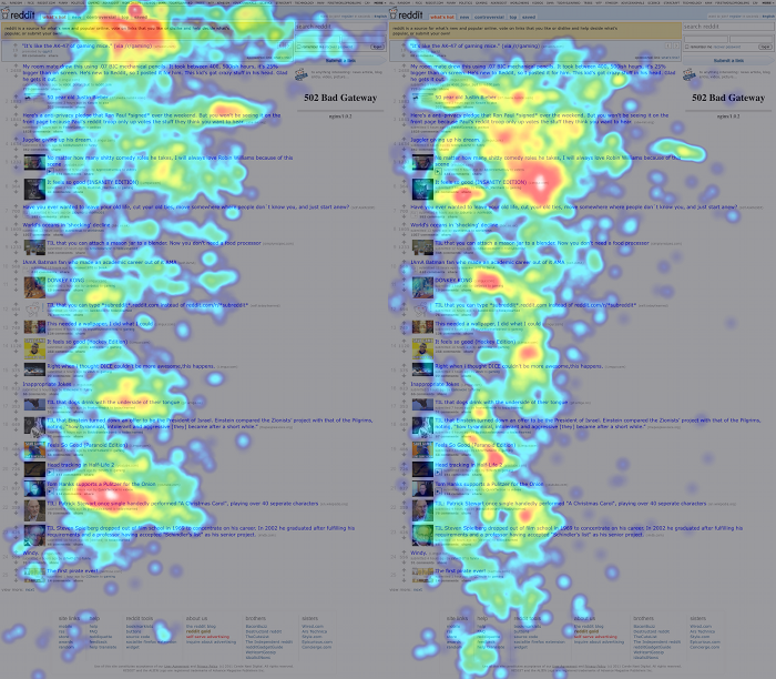
...The two red hot-spots to the right and further down the page.
Is it an emergent distortion because of the heat map? Is it an aggregate spot between the link above and the link below that ends up being significant? Do experienced redditors rest their eyes on blank patches of the page??