In physical UI our group calls this the Microwave Problem. No one uses the 20 extra buttons on the microwave, they mostly just use one or two buttons. But no one will buy a microwave with few buttons.
Hilarious coincidence. I had and loved that exact same model for the same reasons. Until one of the dials broke and I discovered how utterly irreparable the thing is. Had to get rid of it and indeed, it’s impossible to find similarly simple models. Oh well!
I would love a microwave with a slider for power level and a dial for time.
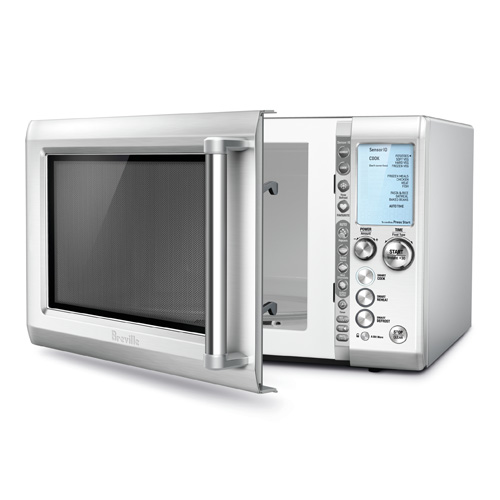
Best I have found so far is the now obsolete Breville BMO734 with jog dials for power and time, plus I use the quick-start and cancel buttons. Importantly you can change power and time even while it is running - very nice. Jog dials are not my favorite but the UI works. Extra feature buttons on inside door jam is a good design although honestly I never use the extra features. Ervery microwave with a keypad has been total shit UI in my experience.
They can, actually! Your microwave probably has an arcane button combo that will turn off the beep. You'd never, ever stumble across it randomly, you need to read the manual. On mine, I need to hold the "2" button for five seconds.
High-end blenders too. All I want is speed dial, pulse switch, and on/off switch. And that's all anyone wants, but for some reason every new generation has to have all these functions nobody uses.
I actually have gotten free Vita-Preps on occasion by doing events with the company. Most everything Vitamix has made for years has all sorts of that stuff. They thankfully still have a base line that is simple.
There is value in choice. Not won't necessary always use just the same two buttons, so people like have the option to use other buttons. And quite often more buttons also come with better specs.
Apple used to sell stuff that had “curated UIs”: few control, few functions, and excellent UX. I remember the cleanliness of the iPod vs the overfeatured and complicated competitors.
iPod was useless without iTunes, and I wouldn't call iTunes a curated, excellent UX. We can't only look at the beautiful light and ignore the angler fish behind it.
PS: if we include Sony's minidisk in the competion, the overall listening experience, especially the wired remote was just better. The digital walkman was still a better UX on the device side, except it has an even worse horrible PC experience and Sony barriers that made it a non starter.
The competitors were too cheap to have any feature, usually they had a big play button, a next and previous button and that's pretty much it.
The settings were usually pretty poor on those mp3 players, on mine you had a microphone mode, language, timezone, some shuffle configuration and that's pretty much it.
The iPod did look much much better and refined but in terms of simplicity, it's hard to beat the single play button of an mp3 player which doesn't know to do anything else. Those things were designed like appliance more than tech products.
I don’t think that’a true. Too many years have passed so I cannot cite makes and models, but I worked in an IT magazine back then and there were mp3 players with a lot of buttons, not unlike those overcomplicated VHS recorders which sold on “features”.
That's true, those also existed but what I've seen, they were not bought as much as the cheap kind. The ipod gave a reason to pay extra, those half way though products really did not.
Alledgedly simple UI (although I never was a Apple guy, was using iRivers at that time), but building the iPod was hard, probably entailing a flew of difficult, complex hardware and design issues to tackle.
Built like a tank. Stainless steel. Compact yet roomy.
And there's no stupid rotating platter.
What they do is rotate the microwave antenna instead. But that's inside the guts somewhere so you never see it. (Why don't they do that on all microwaves? I dunno)
So it's easy to clean. Even cooking. Max microwave.
Well I had a microwave with the rotating platter. And now I have one without. And the one without definitely works better. So that's a strike against your theory.
Only because popcorn manufacturers don't want the quality of their popcorn to be judged by the quality of your specific microwave's popcorn button implementation. They have no control over how it's implemented.
But the button isn't bad. On most microwaves it probably even works well. Of course, if you rarely eat popcorn it's probably an unnecessary extra button.
The IKEA MATÄLSKARE Microwave oven has 4 buttons, I press one to add 30 seconds and another one to cycle through the 4 power settings. That is their mid-range microwave, it has 750 watts of power and the more expensive models seem to have similar controls.
Their low end microwave TILLREDA has two knobs, but I've never used it.
This is also my preferred control scheme, and I bought one a few years ago.
To see what's easy to find now, I typed "microwave oven knobs" into amazon.com and got several with the classic mechanical timer and power knob design. Most of those are relatively small, but "commercial microwave oven" found some larger ones.
What would be the advantage of a button to cancel instead of turning the knob back to zero? It seems like that would add quite a bit of complexity to the mechanism to provide a UI that's just different rather than obviously better.
Honestly, I've had a number of microwaves in my life and I have read the manuals and attempted to use various other types of operation (such as sensor cooking). The reasons why I don't typically use those additional modes of operation are perfectly rational and not due to UI bias as such:
1. I know exactly how to cook something, based on time (and power level), because that's a mental model that's universal across microwaves.
2. I don't know how to cook something and need to follow package directions, which are always expressed as time (and power level).
3. I am iterating towards a desired end state, and want to do so in small step increments. The only possible way to do so is by short bursts of time (at a specified power level).
These are the reasons I've never used any of the extra modes. Technology Connections did an entire hour long video about the popcorn button, and it sounds like at least /some/ microwaves actually implement a very good method, but most don't, and so these types of modes are also generally untrustworthy. Having additional modes has never been a deciding factor in buying a microwave for me, most of the time I bought am microwave based on materials, appearance, and mounting options.
Now, a toaster oven, on the other hand, I want all the modes, and I use them.
> But no one will buy a microwave with few buttons.
Marketing is the king. Spend resources on memeing your way into people minds, then advertise “we removed the cruft to give you <something>” (more space, better experience, whatever you can think of, even if it’s a big stretch) as some sort of revelatory breakthrough and bleeding edge innovation - and they’re gonna buy it and joke about “uncool” others’ microwaves with silly extra buttons are, affirming how cool their microwaves are.